[Second Post in a Series on How to Make an Ebook]
Have you ever walked through the aisle of the bookstore and found yourself reaching for a book without even realizing it?
That’s the power of a good book cover and a goodtitle.
Despite what our mothers told us, most people reallydo judge a book by its cover.
You could have a really good book. The contents of your book could beexactly what a person is looking for. But if the cover and title don’t grabthem, they will never know.
The purpose of a book cover and title is to make a person want to findout more about the book.
The cover and title make the person want to read theback cover of the book. Or in the case of an ebook, the cover and title make aperson want to click and find out more. Without the desire to pick up the bookor click on the ebook, you never have the chance to give them details about thebook. You never have the opportunity to hold their attention long enough tosell them the book or get them to sign up for your email list.
The cover and title make the person want to read theback cover of the book. Or in the case of an ebook, the cover and title make aperson want to click and find out more. Without the desire to pick up the bookor click on the ebook, you never have the chance to give them details about thebook. You never have the opportunity to hold their attention long enough tosell them the book or get them to sign up for your email list.
Let’s looks at these two important items separately.
First, the ebook cover.
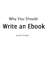
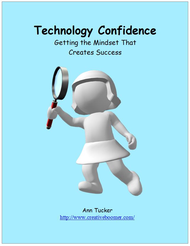
Below are three possible ebook covers for the same ebook. Each gives you a different feeling when you look at it.
Below are three possible ebook covers for the same ebook. Each gives you a different feeling when you look at it.
The first is just text. It’s very boring. There is nothing to catch andhold the reader’s eye. With this cover, they will be on to the next ebookwithout ever clicking on this one.
The second has a very business feel. Visually there is a lot to look atwith the two-tone graded background and the two colors of text.
Also whenever a face is in a picture, the eye naturally is drawn to thatface. In this cover the person is looking straight back at the reader withconfidence.
The third evokes a more emotional feel. With the green stripes and thedoor into the garden, this cover gives a peaceful feeling. The text is all onecolor but arranged on different color backgrounds for visual variety. On thisebook cover, the author’s logo and photo were added to support visual branding.
While a cover can help grab the reader’s attention, it does not grabattention by itself.
The other important element is the title.
Three things to consider when coming up with a title:
1. Don’t preach.
A title like “Why you should write an ebook” sounds just a little toomuch like your mother telling you why you should eat your veggies.
2. Think of a benefit your book gives to your reader.
Instead of “Why you should write an ebook”, a benefit could be “How to beseen as an expert”
3. Make it short.
A good rule of thumb is to keep the title to eight words or under. Thismakes it easier to read. (People don’t like having to wade through a long drawnout title.) It also makes it easy for people to promote your ebook on Twitterand still have room for their reviews or comments and a link to your ebook.
Combine a great title with a great cover design and you are on your way to an ebook that grabs people to want to know more.
You don’t feel comfortable designing an ebook cover?
Click here to see how I can help you.
Come back for the next post in this series.
If you missed the first postin this series, here’s the link to What Should I Write A Book About?
If you missed the first postin this series, here’s the link to What Should I Write A Book About?
If you liked this post, please sign up for my email newsletter at the topright of this page so you don’t miss any of the posts in this series.


{ 5 comments }
Great advice. Covers and titles are so important!
You point is well illustrated with the 3 different covers. Thanks for the great info. stumbled!
Thanks for stopping by. Glad you liked the info.
It is amazing just how much a cover can draw us in or turn us away. Love the considerations.
Thanks Brenna. The visual often affects us more than we realize.
Comments on this entry are closed.